Interactive Design - Project 2: Working Web Page
22.05.2023 - 04.06.2023 / Week 8 - Week 9
Lim Rui Ying / 0358986
Interactive
Design / Bachelor of Design (Hons) in Creative Media
Project 2: Working
Web Page
LIST
Project 2:
Working Web Page
INSTRUCTIONS
PROJECT 2: Working Web Page
WEEK 9
We were tasked to transform the static prototype from Project 1 into a fully
functional and interactive web page that closely aligns with the original
prototype.
Task requirements:
- Review your static prototype from Project 1 and analyse its layout,
typography, colour scheme, and imagery
- Use HTML and CSS to translate the design elements into code
- Aim for pixel-perfect precision while maintaining responsive design
principles to ensure compatibility across different devices and screen sizes
Prototype review
Before working on the web page, I reviewed my prototype web page in Project 1
regarding the layout and typography. I had three-column and four-column
layouts in the prototype.

|
| Fig. 1.2 4-column layout, Week 9 (5/6/2023) |
For the typography, the typeface "Acme Gothic" could not be found on Google Fonts so I searched for an alternative typeface that is available on Google Fonts.

|
|
Fig. 1.3 Fonts used (Source: Google Fonts), Week 9 (5/6/2023) |
Coding process
I first coded the basic content in HTML and distributed each section and the content into grids in CSS by utilising the grid property. Initially, I wrote the code for a desktop view but I realised that a mobile view has to be designed primarily. Thus, I rewrite the main CSS for mobile view and add the media queries for larger screen sizes.
 |
| Fig. 2.1 Coding process (HTML) |
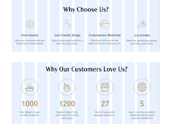
I had 4 rows in 1 column for the benefits and social proof sections.

|
| Fig. 2.2 Benefits and social proof sections (CSS) |
While production series and promotion set sections have 3 rows in 1 column when displaying in mobile view.

|
| Fig. 2.3 Product series and promotion set sections (CSS) |
The footer is divided into 4 rows for each subsection as well.

|
| Fig. 2.4 Footer (CSS) |
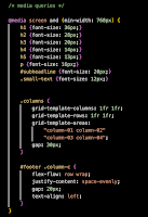
Medium screen size/Tablet view (≥ 768 px)
I changed the font sizes of the headings and normal text not only when the web page is displayed in tablet view but also in larger screen sizes such as 1024 px and 1280px for desktop view.
 |
| Fig. 2.5 Media queries for 768 px (CSS) |
I changed the grid areas of benefits and social proof sections to 2 rows and 2 columns when the screen width is
 |
| Fig. 2.6 Benefits and social proof sections (CSS media queries) |
Larger screen size/Desktop view (≥ 1024 px)
When users view the web page in larger screen size, the layouts of each section change. The number of columns and rows for each section are as follows:
- Product series section: 3 columns 2 rows
- Promotion set section: 3 columns 1 row
- Footer section: 4 columns 1 row
 |
| Fig. 2.7 Product series section (CSS) |
 |
| Fig. 2.8 Promotion set section (CSS) |
Hover effects
For the hover effect on the product series, I implemented a scaled-up effect on the product image, making it larger when hovered over. Besides, I made the product series name and a CTA button appear during the hover. Moreover, I added a colour hover effect to the CTA button, which changes its colour when users hover their mouse over it.  |
| Fig. 2.10 Hover effects on product series section |
To make the product series name and the CTA button appear, I change the opacity from 0 to 1 to create the hover effect.
 |
| Fig. 2.11 Hover effects on product series section (CSS) |
 |
| Fig. 2.12 Hover effect on promotion set section |
As well as the hover effect on the product series name, the image change hover effect also utilised the same approach and added an ease-out transition.
 |
| Fig. 2.13 Hover effect on promotion set section (CSS) |
Scroll down transition
I incorporated a scroll-down button at the bottom of the hero section. I utilised the a tag and added a smooth scroll behaviour to the button. When users click on this button, the web page smoothly scrolls down to the main content section.  |
| Fig. 2.14 Scroll-down transition |
Final Submission
Netlify link: https://project2-soa-ceramics.netlify.app/
Fig. 3.1 Project 2: Working Web Page - PDF, Week 10 (11/6/2023)
FEEDBACK
No feedback was provided
REFLECTION
Throughout this project, I learned how to effectively utilise the grid property, including grid template rows, columns, and areas. I was satisfied with the hover effects I applied to the product series and promotion set sections. However, coding the web page took a considerable amount of time and effort, as I had to spend extra effort to understand and implement the grid and flex display concepts, as well as the website's responsiveness. Overall, this project provided a great opportunity for me to enhance my coding skills and gain proficiency in using the grid and flex properties to position elements on a web page.


Comments
Post a Comment