11.10.2022 - 18.11.2022 / Week 7 - Week 12
Lim Rui Ying / 0358986
Typography / Bachelor of Design (Hons) in Creative Media
Task 3: Type Design and Communication
LIST
Instructions
LECTURES
Class Summary
WEEK 7
Mr Vinod briefed us on Task 3: Type Design and Communication.
This task is a further exploration of advanced typography and an
understanding of the spiritual aspect of typography. We are then given 45 minutes to do preliminary research and reading
for this task and 30 minutes to the library to look for book
references. We are asked to produce several rough sketches of a
letterform and digitise one of them in Adobe Illustrator in the
class, just to let us understand the preceding process of designing
a type. We got quick feedback from Mr Vinod on our first digitised
letterform to get some guidance on constructing our type. Mr Vinod
showed one of the typefaces he designed to show us how his font is
constructed.
WEEK 8
We attended a talk: Go Glyphs by Mr Rainer in week 8 which is
advantageous to this particular task. It was an interesting and
entertaining talk. I was amazed at Mr Rainer's brilliant,
knowledgeable and humorous. We learned about OpenType and its
features of moving glyphs and
replacing glyphs.
Moving glyphs can appear in adjusting kerning and testing the
components of the glyphs in the process of creating glyphs such
as moving upwards and downwards of the crossbar of a glyph to
acquire the most satisfied glyph.
An example of substituting glyphs is the ligatures. Mr Rainer
demonstrated a method of testing the ligatures on Glyphs 3. He
played around with the ligatures in a fascinating way such as
typing periods or spaces to the edited glyphs on TextEdit and
the text turned out surprisingly by changing into other glyphs
in colours, with distortion, disappearing, etc. He also designed
little games like tic-tac-toe and scissors-paper-stone using the
feature of replacing glyphs on Glyphs 3. He played around with
the feature of replacing glyphs of OpenType amusingly.
I could never imagine the types can be played in such an amazing
way. In fact, typography is not as boring as I thought
before.
WEEK 9
Mr Vinod reviewed our sketches for type design and digitisation if
any. Mr Vinod did demonstrations on digitising some of our sketches.
He showed the way of digitising the letter 'o' and deriving it into
the letter 'a'.
WEEK 10
We showed our progress work and get feedback from Mr Vinod. We are
given time to make amendments to our font.
WEEK 11
Mr Vinod gave us feedback on our adjusted glyphs. We are to finalise
Task 3 with final kerning, final font design, a downloadable font link
and final poster design before the deadline we have set. Mr Vinod
advised us to record clear progress of designing the font which proves
we did that work.
Mr Vinod then briefed us on the special task which are Telegram
sticker design and Jaya Grocer Angpow Design Competition. We have to
complete either one of them in groups of 2-3 members.
For the final submission, we are to compile all the final work we have
done in a post named Final Compilation and Reflection. In that post,
we should include all the final submissions (with weeks and dates),
the links to each post and a final reflection by week 13.
INSTRUCTIONS
Task 3: Type Design and Communication (Font Design)
We are to design a limited number of Western (Latin) alphabets, which are a e t k g r i y m p n ! # , . . We have to choose an existing font design which is from the 10 typefaces
provided that we would like to refer to or is the closest typeface to our
sketches. The typeface chosen is just for analysing its anatomical parts and
will not affect our type design. We are required to watch the demo videos
before beginning this task.
To complete:
1. Do research from websites or book references for a better understanding
of type design
2. Deconstruction of several letterforms of the typeface chosen
3. Construct 5 rough sketches or more (at least 5 letters in
each sketch) for further idea exploration
4. Digitisation of sketches in 2-3 variations for further exploration using
Adobe Illustrator
5. Transfer the digitised font into Fontlab for kerning and generating the
font
6. Create a final basic poster in A4 size using the font designed
Notes:
- Maximum canvas size in Fontlab: 1000 pt
- Ideal x-height: 500 pt
- Height of capital letters: about 700 pt
- Sketching with our hand is suggested as it develops our sketching
skills and helps our cognitive development (from mind to hand).
- Consider the hallmarks of a good typeface in our font: subtlety
(fineness), character, presence, legibility and readability.
Submission files:
1. Final kerning in FontLab 7 (screen grab)
2. Downloadable font via Google Drive link (TTF)
3. Final type design (JPEG & PDF)
4. Final poster design (JPEG & PDF; CMYK colour mode)
A quick attempt at sketching and digitising a letterform in class
We are asked to try out the beginning process of designing a font which we
have to conduct a few different sketches of a letterform and choose one of
them to digitise in Adobe Illustrator. Here is the outcome I have done in
class:

|
|
Fig. 1.0 Quick attempt at sketching and digitising a
letterform
|
1. Research
Anatomy of Typography
To identify the guidelines and visual elements that make up the
letterforms within a typeface.

|
|
Fig. 1.1 Anatomy of typography, from Medium site
|
|
Type Classifications
Most typefaces can be classified into one of four basic groups: those with
serifs, those without serifs, scripts and decorative styles.
SERIF Old Style, Transitional,
Neoclassical/Didone, Slab, Clarendon, Glyphic
Serif typefaces are usually classified in terms of contrast, angle of stress
and terminals.

|
|
Fig. 1.2 Serif, referred to the book Typography, Referenced
|
SANS SERIF Grotesque, Humanistic, Geometric, Square

|
|
Fig. 1.3 Sans serif, referred to the book Typography, Referenced
|
|
SCRIPT Formal, Casual, Calligraphic, Blackletter &
Lombardic
DECORATIVE Grunge, Psychedelic, Graffiti

|
|
Fig. 1.4 Script and Decorative styles, images from
Wikipedia
and Google Search Engine
|
Overshoot
Overshoot is the area of a letter that extends a portion beyond the baseline
and either the cap height or mean line. It is essential to create an
optical illusion for the rounded and pointed letters to let them be
the same size as other letters as they look slightly smaller than other
letters (too much extra negative space surrounding them).

|
|
Fig. 1.6 Overshoot guidelines, from the book Exploring
Typography Chapter 8: Designing Type
|
Contrast
The difference between thick and thin strokes. High contrast means a
bigger difference between thick and thin.

|
|
Fig. 1.7 Contrast
|
Angle of Stress
The angle of stress defines the direction of thick and thin strokes.

|
|
Fig. 1.8 Angle of stress
|
2. Deconstruction of letters
I chose Bembo Std Regular, the typeface I am interested in
to conduct the deconstruction of the lowercase letters r,
o and m. I could observe very detailed changes in the glyphs
while deconstructing a letter.

|
|
Fig. 2.1 Deconstructing letters with guidelines, Week 8
(22/10/2022)
|

|
|
Fig. 2.2 Deconstruction of lowercase r, Week 8
(22/10/2022)
|

|
|
Fig. 2.3 Deconstruction of lowercase o, Week 8
(22/10/2022)
|

|
|
Fig. 2.4 Deconstruction of lowercase m, Week 8
(22/10/2022)
|
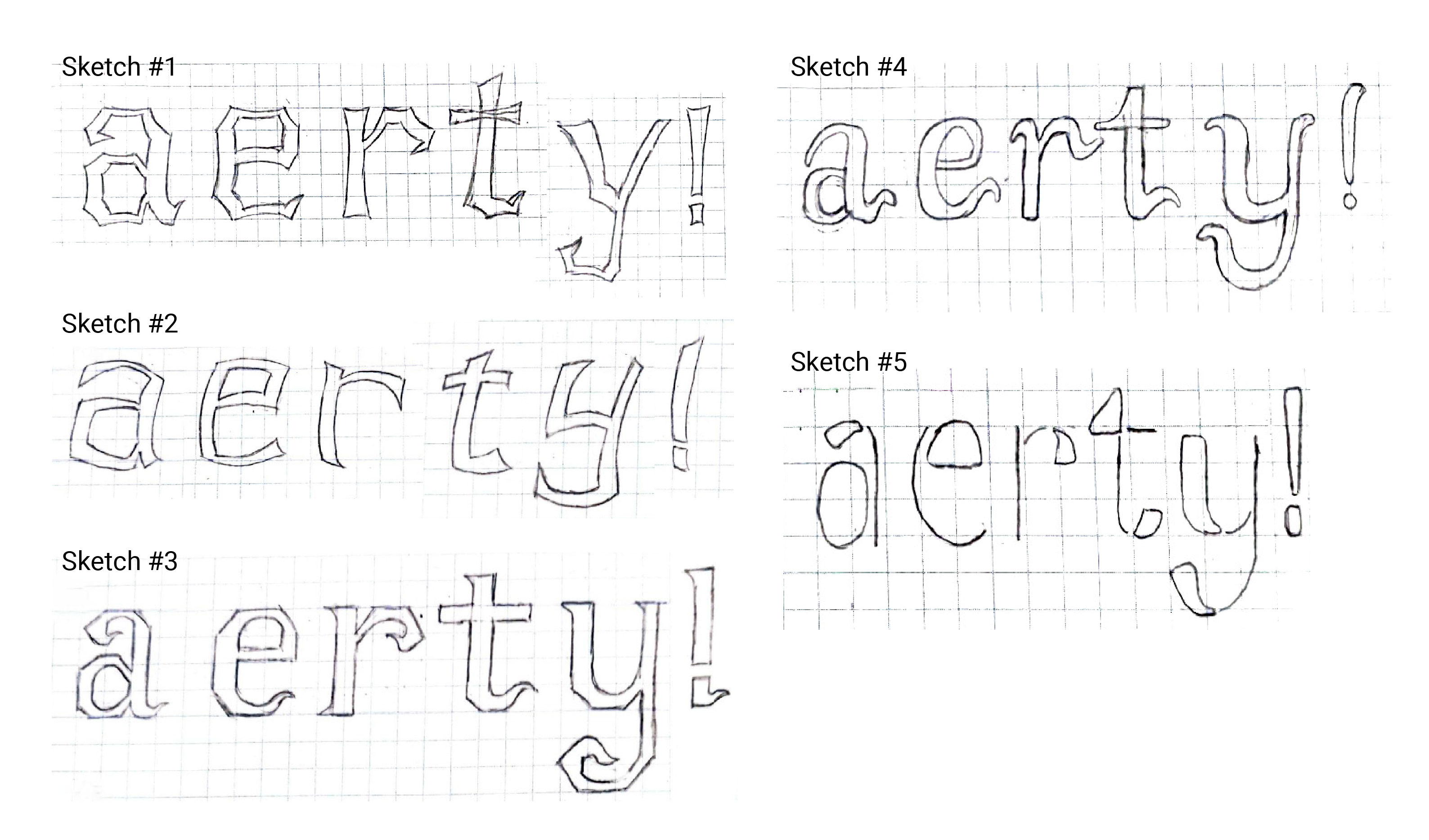
3. Sketches
We are required to conduct at least 5 sketches. I conducted the sketches by
drawing on a grid notebook to ensure the letters are on the same line. My
favourites are sketches #1 and #2 as I like the interesting shapes of the
letterforms. I decided to go with sketch #2 as the simple curved shapes on
each letterform.

|
|
Fig. 3.1 Sketches, Week 8 (22/10/2022)
|
4. Digitisation of letterforms
Creating guidelines
I first created the guidelines based on a 500 pt x 500 pt box to determine
the x-height of Myriad Pro Regular. I created the guidelines with
overshoots as the font I intend to design has curvature strokes so I assume
all the letterforms will overshoot the basic guidelines.
|
|
Fig. 4.1 Guidelines created, Week 8 (24/10/2022)
|
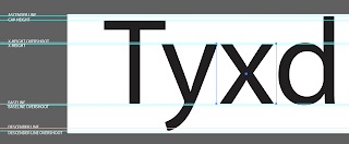
MEASUREMENTS (from baseline)
Ascender: 732 pt
Cap height: 695 pt
X-height overshoot: 510 pt
X-height: 500 pt
Baseline: 0 pt
Baseline overshoot: -11 pt
Descender: -204 pt
Descender overshoot: -228 pt
Failed attempt
I chose sketch #2 for digitisation. I intend to create curvature shapes in
the letterforms (the outlined shape on the letter 'a').
Unfortunately, the digitised letterforms are presented in very weird shapes
as they are constructed without a consistent grid. I considered this a
failed attempt.

|
Fig. 4.2 Failed attempt of digitised sketch #2, Week 8
(24/10/2022)
|
|
Constructing the shape of a vertical stroke
I change the method of creating the curvature strokes and shapes. I
construct a vertical stroke of an x-height as the stem of each letterform
based on the grids in Illustrator and the guidelines created.

|
|
Fig. 4.3 Progress-01: Height and width of a vertical stroke, Week 8
(24/10/2022)
|

|
Fig. 4.4 Progress-02: construction of a vertical stroke, Week 8
(24/10/2022)
|

|
|
Fig. 4.5 Progress-03: construction of a vertical stroke,
Week 8 (24/10/2022)
|
|
Progress of constructing a vertical stoke:
STEP 1 turn on the grids
STEP 2 draw two lines of a column width of the grids, the heights of
both lines:
left line: an x-height (500 pt)
right
line: x-height overshoot to baseline overshoot (522 pt)
STEP 3 apply warp effect to the two lines - 15% of vertical bend
apply the same effect again - 40% of vertical
distortion
-
to create the curvature shape of the vertical stroke from thin to
thick
STEP 4 join the anchor points in the two lines to form a closed path
STEP 5 expand the path into a shape
Below is an overview of the different heights and widths of stroke segments I
created for the construction of letterforms based on the guidelines and
grids.

|
|
Fig. 4.6 Stroke segments created, Week 8 (24/10/2022)
|
Construction of glyphs
I constructed the glyphs by placing the stroke segments together to form
each glyph. Later on, I used Shape Builder Tool to select and combine the
parts that form the glyphs.

|
|
Fig. 4.7 Construction progress of 'a'
|

|
|
Fig. 4.8 Construction progress of 'e', Week 8 (24/10/2022)
|

|
Fig. 4.9 Construction progress of 'n' and 'm', Week 8
(24/10/2022)
|

|
Fig. 4.10 Construction progress of 'y' and 'g', Week 8
(24/10/2022)
|

|
Fig. 4.11 Attempt #1, Week 8 (24/10/2022)
|
Improvised glyphs (after week 9 feedback)
I was suggested to amend the right vertical strokes of the letters 'y' and 'g'
so they are well suited with other letters.

|
|
Fig. 4.12 Progress of adjusting letter 'y', Week 9
(27/10/2022)
|

|
|
Fig. 4.13 Progress of adjusting letter 'g', Week 9
(27/10/2022)
|
|
|
Fig. 4.14 Attempt #2, Week 9 (27/10/2022)
|
|
Improvised glyphs (after week 10 feedback)
I was advised to maintain a regular axis on the top of each vertical
stroke which the axis of the right vertical stroke of the letter 'y' is
slightly slanted compared to other axes.

|
|
Fig. 4.15 Progress of adjusting letter 'y', Week 10
(2/11/2022)
|
Before moving to the kerning part, I realised the arm of the letter 'k'
does not meet the x-height so I made an amendment to it.

|
|
Fig. 4.16 Progress of adjusting letter 'k', Week 10
(2/11/2022)
|

|
|
Fig. 4.17 Final digitised letters, Week 10
(2/11/2022)
|
|
5. Developing final font in FontLab 7
Typo_Task 3_Illustrator To FontLab 5 Demo
Notes:
- measure the guidelines
- combine the glyphs, make sure there are no anchor points too close to
each other
- import the glyphs into FontLab5
- create a new font file and name your font
- key in the guidelines measurements
- underline: -10 pt
- paste the glyphs in FontLab 5 and adjust the kerning
Typo_Task 3_FontLab 7 Demo
Notes:
- ensure the glyphs that are imported into FontLab 7 are in vector
format and adjust the correct settings

|
Fig. 5.0 Typo_Task 3_FontLab 7 Demo video (3:38)
|
Progress of kerning

|
|
Fig. 5.1 Progress of simplifying anchor points in the glyphs,
Week 10 (5/11/2022)
|

|
Fig. 5.2 Progress of kerning: kerning pairs of letter 'k' (left);
kerning overview of sample text (middle);
kerning on poster text (right), Week 10 (5/11/2022)
|

|
|
Fig. 5.3 Final kerning, Week 10 (5/11/2022)
|
|
6. Poster design
We have to create a font poster for the font we designed by using the
generated font. The text for the poster is 'make type great again!'. I have created several designs for the poster.
Requirements:
- poster size: A4 size
- the poster text must be in the same point size
- credit line must include the font name, creator name and the year, the
text should be 12 pt Helvetica

|
|
Fig. 6.1 Poster #1, Week 10 (5/11/2022)
|

|
|
Fig. 6.2 Poster #2, Week 10 (5/11/2022)
|

|
|
Fig. 6.3 Poster #3, Week 10 (5/11/2022)
|
After receiving week 12 feedback, I made another poster (poster #4) based
on Mr Vinod's feedback and I decided to use it as my final poster design.

|
|
Fig. 6.4 Poster #4, Week 12 (17/11/2022)
|
Font Tester
Try typing out the characters: a e i g k m n p r t , . ! #
Final Task 3: Type Design and Communication
|
|
|
Fig. 7.1 Final kerning - JPEG, Week 10 (8/11/2022)
|
|
Final Font Design

|
|
Fig. 7.2 Final Font Design "Reige Regular" - JPEG,
Week 11 (11/11/2022)
|
|
|
Fig. 7.3 Final Font Design "Reige Regular" - PDF, Week 11
(11/11/2022)
|
Final Poster Design

|
|
Fig. 7.4 Final Poster Design - JPEG, Week 12
(17/11/2022)
|
|
|
Fig. 7.5 Final Poster Design - PDF, Week 12 (17/11/2022)
|
TO THE TOP ↑
FEEDBACK
WEEK 7
Fig. 1.0 Quick attempt
Specific feedback
An interesting shape is used in the font but it is a bit craggy and not
well structured, needs to be mastered.
WEEK 9
General feedback
We should have 5 different sketches for this task to see the
difference between each sketch, but not variations from a
sketch.
Specific feedback
Fig. 3.1 Sketches
Sketch #1 has interesting shapes in the letterforms. Sketch #3 seems
to be a toned-down version of sketch #1. Sketches #2 and #5 are
terrible.
Fig. 4.11 Attempt #1
My digitisation for sketch #2 is good in consistency. I have to make
minor amendments to it like adjusting the right vertical stroke
width of letters 'g' and 'y' to get the same feel as other letters
like the letter 'm'.

|
|
Fig. 8.1 Week 9 feedback from Mr Vinod
|
WEEK 10
Fig. 4.14 Attempt #2
General feedback
Excellent work.
Specific feedback
Maintain a regular axis for the vertical strokes which the right vertical
stroke of the letter 'y' has a slightly slanted axis compared to other
axes. I may have to consider whether the small parts that connect the main
strokes have to be more curved. The comma can be slightly longer. I
realised the arm of the letter 'k' does not meet the x-height when I look
back at my font so I rework it.

|
|
Fig. 8.2 Week 10 feedback from Mr Vinod
|
WEEK 11
Fig. 4.17 Final digitised letters
General feedback
Fairly consistent, no issue.
WEEK 12
Fig. 6.4 Poster #4
General feedback
Enlarge the poster text and make the poster more interesting by changing
the text direction.
REFLECTION
ExperienceThis task was completely different from the
previous tasks. I had no idea at the beginning of this task and I spent
quite a lot of time on the research. The process of designing my font was
surprisingly going smoothly just with a little failure that makes the
process suspended.
Digitising the letterforms from sketches
was a tedious and complicated process. I was quite struggled at the
beginning of digitisation. I was more focused on constructing the strokes
of the glyphs but I neglected the main steps of constructing a glyph at
the very beginning which is to construct the letters ‘o’ and ‘i’ first and
only derive them into other glyphs.
However, it was amazing to create a font and generate it into a real
font. The overall process of designing the font was interesting and
enjoyable. I especially enjoy a great sense of accomplishment and
satisfaction as this is the first time I design my own font.
Observations
I have conducted five sketches, two
of them are quite similar with interesting shapes while the other sketches
are barely satisfactory. During digitisation, I was fed up with the failed
attempt and I had no idea how to proceed to the next step. However, I work
on it the next day and it surprisingly worked smoothly.
I
could observe the nuances in the glyphs during the deconstruction of
letterforms. For instance, the right vertical stroke of the letter ‘m’ (of
the font Bembo Std Regular) seems to be straight, but when I look up
closely, there is a slight curve on that particular stroke. It was fun to
explore these nuances in the letterforms.
Findings
We should understand and study the conventions of designing a type well
before doing it. Without doing it so, we would encounter a lot of setbacks
during the process and turn out with inconsistent letterforms, resulting
in making amendments repeatedly. It can be a learning process but avoid
loads of work that make us overwhelmed.
We are too used to the types in our daily life just for
communication purposes. We always neglect the minor changes between each
type. If we try to be more observant of the types on the street, in the
shops, on printed materials and so on, we could notice the fascinating
slight differences among them.
FURTHER READING

|
|
Exploring Typography (2nd Edition) by Tova Rabinowitz
(2016)
|
This is the reference book recommended by Mr Vinod. I have read
through Chapter 8: Designing Type of this book. I would like to
summarise the preparations for designing a type.
1. Guidelines
Guidelines are essential to make sure all characters of a font are on
a line and proportioned consistently. The basic guidelines included
the ascender line, cap line, mean line, baseline and descender
line.
Overshoot is a part of the guidelines. It is to create an optical
illusion for the rounded and pointed letters (O, Q, C, S, A, V, W) to look the same size as other letters because they look slightly
smaller than other letters of the same size.

|
|
Guidelines with overshoot
|

|
The circle and triangle are adjusted to create an optical
illusion that they look similar in height to the square, from
Design With FontForge
|
2. Contrast
Contrast is the variance between the thick and thin letter parts.
Extremely low-contrast fonts look dull and low in legibility, while
extremely high-contrast fonts are dazzling the eyes and distorting the
letterforms, making the letterforms difficult to be recognized.
To create contrast, the stroke weights should vary in thick and thin
parts. For traditional fonts,
- vertical capital stem
stroke: 13-18% of the cap height
- vertical capital hairline stroke: 5-8% of the cap height
- vertical lowercase stem stroke: 80-90% of the vertical capital stem
stroke
- vertical lowercase hairline stroke: 70-80% of the capital hairline
stroke
- curved and diagonal stems need to be slightly wider to optically
match their straight counterparts

|
|
Different stroke weights to create contrast
|

|
|
Curved strokes are slightly wider to create an optical
illusion
|
3. Angle of Stress
The angle of stress should be optically consistent in a font. A typical
font has an angle of stress anywhere between 60 to 90 degrees, relative to
the baseline.

|
|
Angle of stress
|
4. Terminals
The ends of the characters' strokes. Terminals may or may not have
serifs and serifs may be bracketed or unbracketed. We will have to determine the shapes and sizes of both uppercase and
lowercase serifs, barbs and beaks, and decide on the slope and height of
the brackets that connect the serifs to the stems.
For all fonts, we will need to apply consistent shapes and sizes for
terminals including tails, cars, apexes, vertexes, and swashes.

|
|
Bracketed serifs
|
QUICK LINKS
References
Deer, R. T. (2016). Chapter 8: Designing Type. In
Exploring typography (2nd ed., pp. 249–296). Cengage Learning.
al, T. J. et. (2012). Type Classification and Identification. In
Typography, referenced: A comprehensive visual guide to the
language, history and practice of typography
(pp. 52–67). Rockport.


Comments
Post a Comment