27.09.2022 - 16.10.2022 / Week 5 - Week 7
Lim Rui Ying / 0358986
Typography / Bachelor of Design (Hons) in Creative Media
Task 2: Typographic Exploration and Communication
LIST
Instructions
LECTURES
Class Summary
WEEK 5
Mr Vinod briefed us on the next task - Task 2: Typographic Exploration
and Communication. We are required to combine what we have learnt in the
exercises of Task 1 (type expression and text formatting) and apply it to
this task. We are asked to watch the demo video of Task 2 and draw some
layout sketches before starting to create the type expression in the
headline and compose the layouts in InDesign. Mr Vinod has mentioned all
the requirements of this task clearly.
WEEK 6
We are asked to look around at our classmates' works and give them feedback.
It was interesting listening to peers' feedback, we can notice the mistakes
that we do not realize and get some opinions from them. While Mr Vinod looked
through our e-portfolio and write his feedback in the Google Sheets. We are
warned to complete the text formatting task with at least four layouts and our
e-portfolio at the earliest. Mr Vinod gave us feedback on our layouts. We are
allowed to refer to and analyse seniors' work but avoid getting too influenced
by their work.
WEEK 7
We have to complete and update this post of Task 2 as soon as possible to meet
the deadline this coming Sunday.
INSTRUCTIONS
TASK 2: Typographic Exploration and
Communication
This task is a combination of two exercises of Task 1. We are assigned to
express typographically the content provided in a 2-page editorial spread (200
mm x 200 mm). We have to choose one from the three text options provided as
the content. We are required to utilise the knowledge gained in previous
exercises and from other modules for this task. We should also watch Typo_Task
2_Process Demo before we begin this task.
Task requirements
- We should use the 10 typefaces provided in this task.
- Sketches and digitised sketches are required as parts of the process of
composing layouts.
- A good layout is that the headline expression has an interesting interaction
with the body text.
Headlines
- We may use Adobe Illustrator to create headline expressions.
- Only minor graphical elements are allowed, i.e. line, shade, etc.
Layouts
- We must use Adobe InDesign to compose the layouts.
- No images are allowed, only minor graphical elements are allowed.
- Do not place body text and important information in the gutter between two
pages. Exception for the large and clear headline is allowed to go across the
gutter.
Submission requirements
- Spread size: 2 pages of 200 mm x 200 mm on each page
- File size: 300 ppi
- Format: 2 JPEGs and 2 PDFs (with and without grids)
- Additional layout information is required
- Black and white colour
1. Visual References
I decided to make an expression on the word 'Code' in the headline so I Google
searched the images of 'code'. I explore some layout designs from the
Pinterest site as well.
Fig. 1.1 Visual references for headline exploration, from the Medium
site
|
Fig. 1.2 Visual references for layout exploration, from
Pinterest
|
Image References
right:
https://medium.com/@cortneythomas/laymans-coding-what-is-the-minimum-html-you-need-for-a-website-eda987b02622
right:
https://www.pinterest.com/pin/136937644911539781/
2. Sketches
I came out with four sketches with different expressions of headlines and
layouts. I have mentioned the typefaces of the headlines and the number of
columns on a page beside each sketch.

|
|
Fig. 1.3 Sketches, Week 5 (2/10/2022)
|
3. Headline Expressions Exploration
For the expressions of the headlines, I want to make expressions on the
word 'Code'.
I started digitising the headline of sketch #1 (Fig. 1.3 top). I use
the concept of HTML code in sketch #1. However, I found out that the
word 'Code' in this article is defined as a set of principles accepted
and used by a society or a particular group of people. Thus, I try other
attempts without using that design.

|
|
Fig. 1.4 Headline #1, Week 5 (2/10/2022)
|
I made one variation for the other three headlines of my sketches and
proceed to layouts exploration with each headline.

|
|
Fig. 1.5 Headlines #2 and #3, Week 5 (2/10/2022)
|
4. Layouts Exploration
I made a layout attempt on sketch #1 (Fig. 1.3 top) but the text is too
long that cannot fit on a page. As a result, sketch #1 has
failed.

|
|
Fig. 2.1 Failed attempt of sketch #1, Week 5 (2/10/2022)
|

|
|
Fig. 2.2 Layouts, Week 5 (2/10/2022)
|

|
|
Fig. 2.3 Layouts blocked out, Week 5 (2/10/2022)
|
Shortlisted layouts
|
|
Fig. 2.4 Layout #1, Week 5 (2/10/2022)
|
HEAD
Font/s: Futura Std Light (Follow, the), Medium Condensed
(Code)
Type Size/s: 35 pt (the), 145 pt (Follow), 175 pt (Code)
BODY
Font/s: Adobe Caslon Pro Regular,
Bold, Italic (body text)
Type Size/s: 10 pt (body text)
Leading: 12 pt (body text)
Paragraph spacing: 12 pt
(body text)
Characters per-line: 39 characters
Alignment: Left
aligned
Margins: 10 mm (top, bottom, left, right)

|
|
Fig. 2.5 Layout #2, Week 5 (2/10/2022)
|
HEAD
Font/s: Futura Std Light (Follow, the), Bold (Code)
Type Size/s: 35 pt (the), 100 pt (Follow), 105 pt (Code)
BODY
Font/s: Adobe Caslon Pro Regular,
Bold, Italic (body text)
Type Size/s: 10 pt (body text)
Leading: 12 pt (body text)
Paragraph spacing: 12 pt (body
text)
Characters per-line: 39 characters
Alignment: Left aligned
Margins: 10 mm (top, bottom, left, right)
Layouts after feedback and week 6 class
After the week 6 class, I made some adjustments to the shortlisted
layouts and created more layouts to have a better exploration of
layouts.

|
|
Fig. 2.6 New layouts based on feedback, Week 6 (7/10/2022)
|

|
|
Fig. 2.7 New layouts blocked out, Week 6 (7/10/2022)
|
New shortlisted layouts

|
|
Fig. 2.8 Layout #2.1, Week 6 (7/10/2022)
|
HEAD
Font/s: Futura Std Light (Follow, the), Bold (Code)
Type Size/s: 35 pt (the), 100 pt (Follow), 105 pt (Code)
BODY
Font/s: Adobe Caslon Pro Regular,
Semibold Italic (body text), Adobe Caslon Pro Bold Italic (subtext)
Type Size/s: 10 pt (body text), 14 pt (subtext)
Leading: 12 pt (body text), 18 pt (subtext)
Paragraph spacing: 12 pt (body text)
Characters per-line: 39 characters
Alignment: Left aligned
Margins: 10 mm (top, bottom, left, right)
Columns: 6
Gutter: 5 mm

|
|
Fig. 2.9 Layout #3, Week 6 (7/10/2022)
|
HEAD
Font/s: Univers LT Std 55 Roman (the), 59 Ultra Condensed (Follow), 75
Black (Code)
Type Size/s: 36 pt (the), 90 pt (Follow), 116 pt (Code)
BODY
Font/s: Univers LT Std 55 Roman, 65
Bold Oblique (body text), Univers LT Std 55 Oblique (subtext)
Type Size/s: 10 pt (body text), 18 pt (subtext)
Leading: 12 pt (body text), 24 pt (subtext)
Paragraph spacing: 12 pt (body text)
Characters per-line: 50 characters
Alignment: Left aligned
Margins: 10 mm (top, bottom, left, right)
Columns: 4
Gutter: 5 mm

|
|
Fig. 2.10 Layout #4, Week 6 (7/10/2022)
|
HEAD
Font/s: Futura Std Book (Follow, the), Extra Bold (Code)
Type Size/s: 40 pt (Follow, the), 125 pt (Code)
BODY
Font/s: Adobe Caslon Pro Regular, Semibold Italic (body text), Adobe Caslon Pro Bold Italic (subtext)
Type Size/s: 10 pt (body text), 18 pt (subtext)
Leading: 12 pt (body text), 24 pt (subtext)
Paragraph spacing: 12 pt (body text)
Characters per-line: 60 characters
Alignment: Left aligned
Margins: 10 mm (top, bottom, left, right)
Columns: 4
Gutter: 5 mm
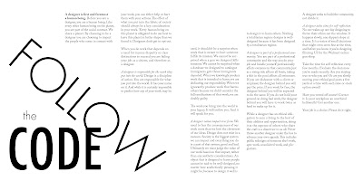
Final Task 2: Typographic Exploration and Communication
I chose layout #2.1 as my final layout for this task as it has a
significant flow in the body text compared to layouts #3 and #4.

|
|
Fig. 2.11 Final layout (without grids) - JPEG, Week 7
(13/10/2022)
|

|
|
Fig. 2.12 Final layout (with grids) - JPEG, Week 7
(13/10/2022)
|
HEAD
Font/s: Futura Std Light (Follow, the), Bold (Code)
Type Size/s: 35 pt (the), 100 pt (Follow), 105 pt (Code)
BODY
Font/s: Adobe Caslon Pro
Regular, Semibold Italic (body text), Adobe Caslon Pro Bold Italic (subtext)
Type Size/s: 10 pt (body text), 14 pt
(subtext)
Leading: 12 pt (body text), 18 pt
(subtext)
Paragraph spacing: 12 pt (body
text)
Characters per-line: 39 characters
Alignment: Left
aligned
Margins: 10 mm (top, bottom, left,
right)
Columns: 6
Gutter: 5 mm
Fig. 2.13 Final layout (without grids) - PDF, Week 7
(13/10/2022)
Fig. 2.14 Final layout (with grids) - PDF, Week 7 (13/10/2022)
FEEDBACK
WEEK 6
Fig. 2.5 Layout #2
General Feedback
I made an expression on the word 'Code'
in the headline of 'Follow the Code' by using a bold typeface
while a light typeface for the word 'Follow' and 'the' to create
contrast in the headline. Mr Vinod commented I did a great job. Mr
Vinod advised us to explore more by creating more layouts. It
helps to develop a habit of doing explorations, and it even benefits other assignments.
Specific Feedback
I have to separate the subheadline from
the body text. I was suggested to use italic bold for the
lead-in-text in some of the paragraphs. I noticed I made a widow
mistake in the second paragraph of the fourth column.
Classmates' feedback
Headline: the word 'the' between the letter 'C' and 'O' is in an awkward
position.
Body text: lower down the first column of the body text to create a flow in
the columns of the body text.
REFLECTION
Experience
I have used what I learned from Task 1 in this task as it is the
combination of two exercises in Task 1. I started with sketches first
and proceed to headline and layout explorations. It was slightly
different from the two exercises when I was arranging the headline and
body text. Unlike the usual one, we went through the feedback session
by giving feedback to our classmates and getting opinions from them as
well. Mr Vinod then only gave us short feedback on our work and some
advice on our e-portfolio organization.
Observation
I have made some headline variations from my sketches. We may pop up
new ideas while exploring different attempts. During the feedback
session, we are exercising our judgment by looking at peers' work and
giving feedback based on what we have ascertained from Task 1 and
previous classes. Feedback given by Mr Vinod on this task helps me to
discover a larger perspective of judgment. Mr Vinod's advice on our
Task 1 posts helps me a lot in organizing this task.
Findings
I found that it is important to know the rules well before breaking the
rules. Same as for the steps of doing this task, we should first sketch
out our idea and continue to the digitisation of headlines and layouts.
It is also essential to explore more attempts as much as possible in the
design process to discover different ideas. The most vital thing in a
composition is the flow. It creates a visual impact and interacts
with the viewers.
The previous task helps me to improve a lot in this task. I am more
aware of the rules when making headline word expressions and
creating layouts. It will become easy when we are familiar with the
rules well and the fun fact is we can play around with them by
breaking the rules.
FURTHER READING

|
The Vignelli Canon by Massimo Vignelli (2010)
|
I have read about the
White Space in Part Two: The
Tangibles of this book.
White space is essential in design. It is important in defining the
hierarchy of every element, which helps to separate the different parts of
the message and position the message in the context of the page.
White space can be manipulated in many forms such as tight margins and wider
margins, tight type setting and loose type setting, decreasing or increasing
the letter spacing, etc. All the space manipulation is used in layouts to
achieve the desired expression. The relationship between the type size and
the space around it is one of the most precious elements in a composition.
Mastering the use of white space on a printed page is the most attribute of
American graphic design just like space is the protagonist in
Frank Lloyd Wright's architecture.
American graphic designers have used white space as the significant
silence to better hear their message loud and clear.
This is the power of white space.

|
Five Phrases to Live By: Massimo Vignelli
03 If you can design
one thing, you can design everything.
from
ESQUADERA
|


Comments
Post a Comment