Advanced Interactive Design - Task 2: Interaction Design Planning & Prototype
20.05.2024 - 13.06.2023 / Week 5 - Week 8
Lim Rui Ying / 0358986Advanced Interactive Design / Bachelor of Design (Hons) in Creative Media
Task 2: Interaction Design Planning & Prototype
INSTRUCTIONS
TASK 2: Interaction Design Planning & Prototype
This is a continuation of Task 1. In this task, we need to plan the
website's interactive elements by demonstrating the animations. This can be
done using Figma or After Effects, or by finding animation examples or
references.
Task requirements:
- Storyboard the animations (on load, in page, off-screen) to showcase how the animations play.
- Create animations or find similar animation references to be included in the website.
Storyboarding animations:
- On load animation: Animations that occur when a webpage or content initially loads.
- In page animation: Animations active while the user interacts with the page.
- Off-screen animation: Animations that occur when navigating away from the current page.
Revision on Website Content (Task 1)
Before I started planning the animations for my website, I asked Mr. Razif
for feedback on the scrolling pages, including the Album page and About
page. He suggested changing the scrolling pages to non-scrollable ones and
using buttons to navigate between them. Based on the feedback, I made
further adjustments on the website content and added navigation on each
page. Below is the revised user flow for my website.

|
| Fig. 1.1 Revised user flow |
1. Research
I researched on animations for the Album page and layouts of the web music
player to create adequate and smooth animations and intuitive layouts for
my website.
Image reveal animations
I discovered a football game website,
UFL, which
implements intriguing sliding animations to reveal or hide text and
images, serving as transitions between content changes. I applied
similar animations for the page transitions on the Album page.

|
| Fig. 1.2 Image reveal and hide animations on UFL |
Web music player
Next, I searched for several web music players including Spotify,
YouTube Music and NetEase Cloud Player to use as references for
designing the music player layout on my website. I observed their
interface design and controls, noting that the controls are typically
located at the bottom. These include buttons for play/pause,
previous/next track, shuffle, repeat, volume level, progress bar, queue,
and lyrics.
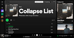
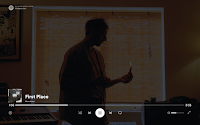
Fig. 1.3 Spotify Web Player
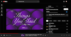
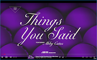
Fig. 1.4 YouTube Music
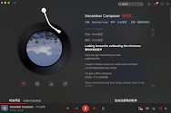
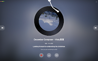
Fig. 1.5 NetEase Cloud Music
2. Revised Album Page
I made amendments to the Album page by converting it into three pages
instead of one scrolling page. Layouts remained the same and I added the
page number at the bottom right of each page to inform users which page they
are on.

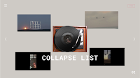
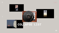
Fig. 1.6 Revised Album Page
3. Revised Music Player
I also made adjustments to the controls of the music player, as well as the
lyrics.
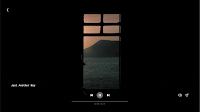
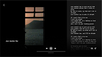
Fig. 1.7 Revised Music Player
4. Revised About Page
Same as Album page, I converted About page into three pages and added buttons
for users to navigate between the pages.
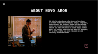
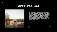
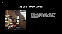
Fig. 1.8 Revised About Page
Animation Planning
Loading Page
On load
- The loading page fades in.
- The vinyl and a loading progress bar appear.
In page
- Vinyl rotates while the loading progress bar fills up gradually, showing the loading process.
Interactive elements
- None
Off-screen
- The loading page fades out.
Landing Page

|
| Fig. 2.2 Landing Page |
On load
- The background slides down from the top of the screen.
- The artist slides up from the bottom, overshooting slightly before setting at the bottom, creating a bounce effect.
- "Novo Amor" slides in from the right, positioning at the back of the artist.
In page
- Endless horizontal scrolling text: "Novo Amor" endlessly scrolls from right to left.
Interactive elements
Hover:
- Album cover: Slightly enlarged, followed by the "LISTEN" button appearing by zooming in.
- Artist: Image and "ABOUT THE ARTIST" button appear by zooming in.
- "LISTEN" or "ABOUT THE ARTIST" buttons: Border turns white, text becomes bold.
- "STORE" button: Fills with pink colour, and the text becomes white and bold.
Click:
- "LISTEN" button navigates to the Album page.
- "ABOUT THE ARTIST" button navigates to the About page.
- "STORE" button navigates to Novo Amor's merch store.
Off-screen
- The landing page slides up when navigating to other pages.
Album Page
|
| Fig. 2.3 Album Page |
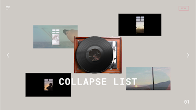
On load
- The album page fades in with a grey background.
- Vinyl player and "COLLAPSE LIST" album name are revealed at the centre.
- Track images are revealed by sliding out from the corners of the vinyl player.
- Hamburger menu, page number and “STORE” button slide in from the corners.
- Next and previous page buttons slide in from the sides.
In page
- Next/previous page button slightly shifts to the right/left and returns to the original position in a looping pulsing motion, suggesting navigation to the next page.
- Animations when users navigate between the track pages:
- The page number at the bottom right corner changes when users navigate to the next or previous page.
- Track images on the current page slide back to the corners of the vinyl player.
- Track images on the next page reveal by sliding out from the vinyl player. (this is same as the on load animation of the Album page)
Interactive elements
Hover:
- Tracks: Play a 15-25 second preview of the official video, revealing the track name below.
- "STORE" button: Fills with pink colour, and the text becomes white and bold.
Click:
- Hamburger menu: Navigate to Home, Tracks and About page, menu lines shift to a single line, revealing text buttons.
- Tracks: Navigate to the music player.
- Next/Previous page button: Navigate to the next or previous page.
- "STORE" button navigates to Novo Amor's merch store.
Drag:
- Users can interact with the vinyl player in the middle by dragging the needle onto the vinyl, making it rotate.
Off-screen
- The album page fades out to black.

|
| Fig. 2.4 Music Player |
On load
- The music player page fades in.
- Back button and controls (play/pause, next/previous, mute/unmute, lyrics) appear.
- After 2 seconds, controls slide down for a full-screen experience.
In page
- Video plays automatically.
- Progress bar displays the current track progress.
Interactive elements
Hover:
- Bottom section: Controls slide up for interaction, allowing users to manage the playback of their music.
- Control buttons: Display button names such as "Play" "Mute" and "Lyrics".
Click/Keyboard:
- Play/Pause button: Clicking the button or pressing space on the keyboard can toggle between playing and pausing the music.
- Next/Previous track buttons: Skip to the next track or go back to the previous track.
- Mute button: Toggles between muting and unmuting the audio.
- Lyrics: Shows the lyrics of the current song.
- Back button: Navigate back to the Album page.
Off-screen
- The music player page fades out.
About Page

|
| Fig. 2.5 About Page |
On load
- "ABOUT NOVO AMOR" slides up to the middle.
- Image of Novo Amor slides in from the left.
- Description slides in from the right.
In page
- Images of Novo Amor loop continuously, pushing previous images to the left.
Interactive elements
Hover:
- Next button: White arrow slides from the left and fills the box with pink colour.
Click:
- Next button: Navigate to the next page, enabling users to continue reading the description of Novo Amor.
Off-screen
- The About page fades out into black.
Final Submission
Website Prototype
Task 2: Interaction Design Planning & Prototype - FIGMA,
Week 8 (13/6/2024)
Presentation Video
Presentation Video - Task 2: Interaction Design Planning & Prototype, Week 8 (13/6/2024)
FEEDBACK
WEEK 7
Instead of using scrolling pages, convert them into non-scrollable ones, as
it might be challenging to create scrollable pages on Adobe Animate. Use
buttons to navigate between the pages.
REFLECTION
Planning the animations through storyboarding and prototyping provided me
with a clear visualisation of how the animations on my website would
function. This task will greatly aid us in our final project when we
animate in Adobe Animate. While doing the prototype, I focused on
transitions between pages, including easing and duration, to ensure smooth
changes. I also realised some layouts on my website could be enhanced with
more interesting animations or dynamic designs. Lastly, I hope to
successfully create the animations in Adobe Animate for my website in the
final project.


Comments
Post a Comment